
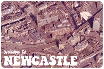
In Newcastle's case, I've gone for a faded pink/red colour cast so typical of the Seventies, and I've gone for a retro font treatment to go with the colours. The view is from Google Maps and depicts the train line that runs through Newcastle, with the Castle Keep, Vermont Hotel and Moot Hall to its south, with the Black Gate, Milburn House and St Nicholas' Cathedral to the north.
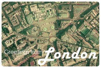
In the case of London, I went for a more faded, vintage colour, and a Fifties style font to match the colour. The view is of Trafalgar Square, with the National Gallery in the top centre of the image. It just goes to show that you can find source material in all sorts of places.
What do you think?


well done pulling a great 60's/70's look.
ReplyDelete