Tweet
Last week I showed one method for achieving that 'toy camera' look, and I promised to show another method. Chris Spooner has also featured a third method, so you've got plenty of options!
Open your image in Photoshop. I'm using one of my own images of the Grainger Market in Newcastle.
Add a Curves adjustment layer.
Choose ‘Red’ from the dropdown channel menu and edit the curve to match the one in the picture.
Also choose ‘Green’ and ‘Blue’ and edit the lefthand half of the curve by dragging downwards to make the image look very red.
With the adjustment layer active, add a layer mask.
Click on the Gradient Tool. Draw a Black-White gradient across the image so that the red portion remains on the left.
Add another Curves adjustment layer and click on the ‘Blue’ dropdown channel. Drag the left half upwards to turn the image blue. Add a layer mask and add a gradient going in the opposite direction.
Now, a lot of these toy camera images have vignettes. So draw an ellipse with a feather of around 200px - invert the selection and, on a new layer, fill it with black. Set the blending mode to 'multiply' and lower the opacity. I like my vignettes to be extra strong at the edges so I painted along each edge of the image with a soft-edged black brush on a new layer, which I set to 'soft light'.
And there you have it!
Which method do you prefer?
Tuesday, 4 June 2013
Tuesday, 28 May 2013
Achieving the Toy Camera look (1 of 2)
Tweet
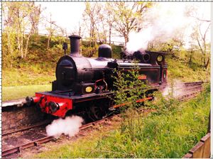
I got a Canon Powershot A810 for my birthday this year, and I've been experimenting with the image modes that it ships with. Normally I would shoot everything on P mode and make my edits in Photoshop - you might wonder why, since you can often achieve good effects with the modes, but the problem is, if you use the mode, there's no way of recovering the image without the edits applied by the camera. Applying the edits in Photoshop allows for greater flexibility. However, I'm particularly taken with the 'Toy camera' mode, which seeks to emulate the plastic toy cameras that have become all the rage in photography circles of late. This is an image of a steam engine on the Tanfield Railway that I took with the mode.
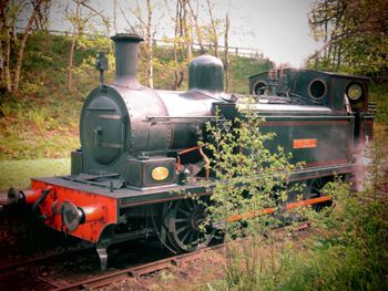
I really like it, but at the same time, I still prefer to take images in P mode and edit them later. So in this post, and the next, I'm going to show two ways of 'faking' the toy camera look in Photoshop.
First, I've opened my image. You can see that it's a fairly flat and lacklustre image, as most digital photos are when they're straight from the camera.
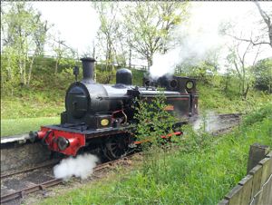
Next, I've cropped the image to easily centre the engine. I usually divide the width by the height of the image to get the ratio, to ensure that any cropping preserves the proportions of the image. For this camera, the ratio is 1.33.
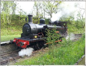
Now, I've added a Curves image adjustment layer to boost the contrast. An easy way to do this is to create an S curve by moving curve up at the top right point, and down at the bottom left point.
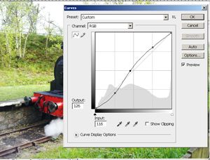
Next, I added another Curves adjustment layer, but in this case, I changed the channel using the dropdown box. I added curves for the Red, Green and Blue channels to give the image that red cast.
Finally, I added a dark brown layer over the top, set the blending mode to 'Multiply', lowered the opacity, and used a layer mask to paint out the centre. This gives the vignette look so common to toy cameras.
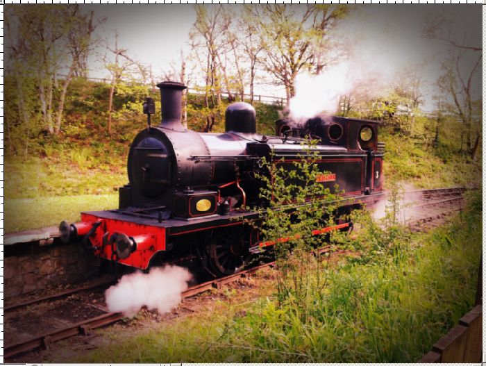
And that's it! Next week I'll post the alternative method as well.

I really like it, but at the same time, I still prefer to take images in P mode and edit them later. So in this post, and the next, I'm going to show two ways of 'faking' the toy camera look in Photoshop.
First, I've opened my image. You can see that it's a fairly flat and lacklustre image, as most digital photos are when they're straight from the camera.

Next, I've cropped the image to easily centre the engine. I usually divide the width by the height of the image to get the ratio, to ensure that any cropping preserves the proportions of the image. For this camera, the ratio is 1.33.

Now, I've added a Curves image adjustment layer to boost the contrast. An easy way to do this is to create an S curve by moving curve up at the top right point, and down at the bottom left point.

Next, I added another Curves adjustment layer, but in this case, I changed the channel using the dropdown box. I added curves for the Red, Green and Blue channels to give the image that red cast.

Finally, I added a dark brown layer over the top, set the blending mode to 'Multiply', lowered the opacity, and used a layer mask to paint out the centre. This gives the vignette look so common to toy cameras.

And that's it! Next week I'll post the alternative method as well.
Labels:
digital
,
photography
,
Photoshop
,
tutorials
Wednesday, 1 May 2013
Lomo Photography
Tweet
I've been keen on photography since I adopted my mother's Agfa Instamatic at the age of ten, and while I usually use digital (a Canon 400D, Canon Powershot A810 or my Samsung Galaxy S2 being preferred cameras), I've had a Pentax ME Super for a few years too. There's just something about the quality of the images that you can't achieve with digital, even using Photoshop.
I think, in all honesty, that I prefer my Pentax as the picture quality is much better, and naturally the controls are more extensive - I have more than two shutter speeds, two apertures and four focal points to choose from. But at the same time, my Lomo is smaller, it doesn't require batteries, and there's something organic about the pictures that I want to experiment with further. Watch this space!
I took this image of the fountain in Trafalgar Square, and managed to use a long enough exposure to give the water the milky texture so intrinsic to photos of water. Using ISO400 film meant that there was enough grain to give the image the sort of noise that you'd normally avoid in digital photography, but which works so well with film.
I took this image inside the Natural History Museum using Ilford's black and white film. Most film labs now process black and white film in colour fluid, which gives a reddish-brown tinge to black and white. I love monochrome photography anyway but this particular effect just seems so much richer than anything I could achieve in Photoshop.
I've been fascinated for a while by Lomo photography, which is the form of film photography which uses plastic 'toy' cameras, complete with defects such as light leaks, or strange colour effects. I took this shot at Woodhorn Colliery near Ashington and the fact it's slightly over exposed gives it a strange, eerie feel, while the overcast sky has a pinkish colour cast. I love the square frames of lomo photography, and it's amazing how simply clicking a button on a tiny camera gives me a more organic feel than anything I might throw together in Instagram.
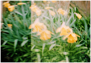
I took this shot of the daffodils in our back garden, and it's obvious that I've quite monumentally screwed it up. I was shooting square frames but I wasn't advancing the film enough between shots, meaning I got this strange, ghostly effect as the centre portion is double exposed. The fact the film was exposed twice explains why it's brighter, as more light has been let in, and the image is slightly blurred as I had the camera on the wrong shutter speed, meaning I had too much motion in the camera at the point of exposure.
I think, in all honesty, that I prefer my Pentax as the picture quality is much better, and naturally the controls are more extensive - I have more than two shutter speeds, two apertures and four focal points to choose from. But at the same time, my Lomo is smaller, it doesn't require batteries, and there's something organic about the pictures that I want to experiment with further. Watch this space!
Labels:
film
,
lomo
,
photography
Monday, 22 April 2013
Drawing Cartoon Characters
Tweet
I recently treated myself to a Wacom Bamboo Tablet with this weird notion that I'd be able to turn my hand to digital painting. Sadly my artistic style doesn't seem to lend itself well to what I want to be able to do, so I ended up just doodling my usual type of character, and I thought I'd go through my process to show how I got from start to finish.
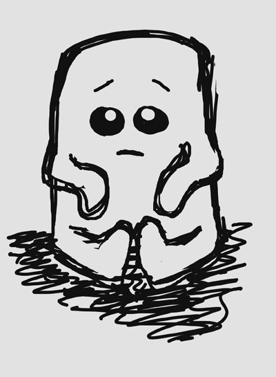
I flood filled the background with pale grey, and on a new layer, sketched this out loosely with a small, hard-edged round brush using black.
I flood filled the background with pale grey, and on a new layer, sketched this out loosely with a small, hard-edged round brush using black.
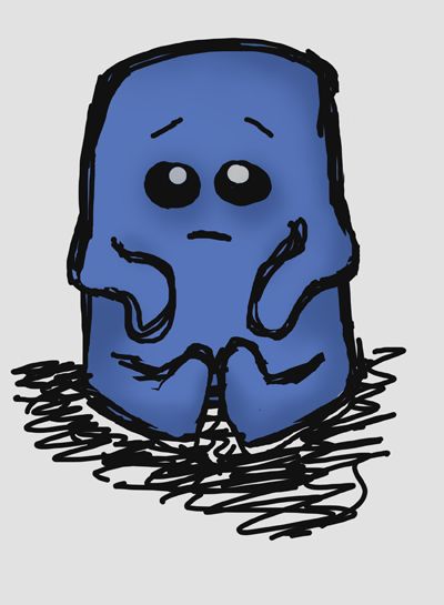
Now I created a new layer between the background and the black lines, and used a larger brush to colour the character in mid blue.
With that done, I created a new layer between the blue layer and the lines, and painted in shadows with a darker shade of blue and a soft-edged brush on a low opacity.
I repeated the last step, albeit this time using a lighter shade of blue to give highlights. Et voila!
What about you? Have you ever used a graphics tablet, and if so, did you find it difficult to get used to?
Labels:
cartoon
,
create from scratch
,
digital painting
,
Photoshop
Sunday, 7 April 2013
Quickly Lighten a Night Time Shot
Tweet
It's always a shame when you take a photo at night and find that even if you used a decent shutter speed or a flash, the image is still a little dark. So today we'll have a look at a quick and easy way to lighten your images in Photoshop. I'm using an image of the Northern Goldsmiths jewellers in Newcastle upon Tyne.
Open your photo. You won't get very far if you don't.
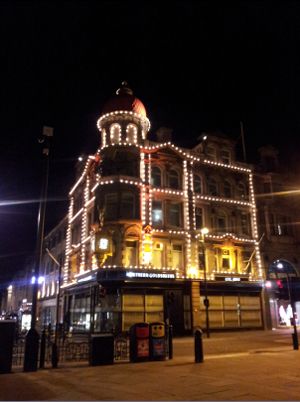
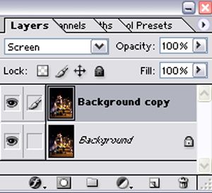
Now, duplicate the layer. Either drag the Background layer down to the New Layer icon, or just press Ctrl+J/Cmd+J. Set the blending mode of this layer to 'Screen'.
It already looks lighter, but we need to do a bit more to it to improve its look.
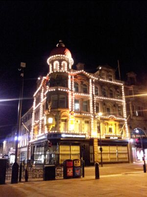
Click on the Adjustment Layers icon at the bottom of the layer palette and select 'Curves'. Give yourself an S curve a bit like this, to boost the highlights and darken the shadows.
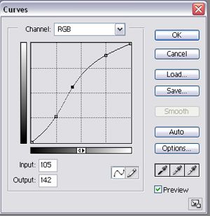
The settings you choose will depend on your image, but an S curve of some description is a pretty safe bet. You'll get an image with more contrast. It already looks less 'flat' than the image that came out of the camera.
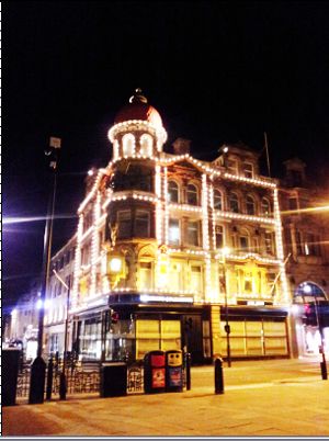
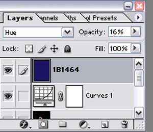
It's kind of yellow, which you could fix by altering the colour balance with a new adjustment layer, but I want a bit of a 'filter' effect. I've created a layer that I flood filled with dark blue (hex code 1B1464). I set this to Hue and lowered the opacity.
You should end up with something a bit more like this!
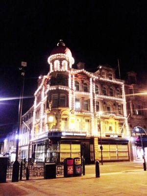
And there you go! It's such a simple technique, and by altering the curves or using different coloured overlays, you can achieve all kinds of effects depending on what you're going for. Have fun!
Open your photo. You won't get very far if you don't.

Now, duplicate the layer. Either drag the Background layer down to the New Layer icon, or just press Ctrl+J/Cmd+J. Set the blending mode of this layer to 'Screen'.

It already looks lighter, but we need to do a bit more to it to improve its look.

Click on the Adjustment Layers icon at the bottom of the layer palette and select 'Curves'. Give yourself an S curve a bit like this, to boost the highlights and darken the shadows.

The settings you choose will depend on your image, but an S curve of some description is a pretty safe bet. You'll get an image with more contrast. It already looks less 'flat' than the image that came out of the camera.

It's kind of yellow, which you could fix by altering the colour balance with a new adjustment layer, but I want a bit of a 'filter' effect. I've created a layer that I flood filled with dark blue (hex code 1B1464). I set this to Hue and lowered the opacity.

You should end up with something a bit more like this!

And there you go! It's such a simple technique, and by altering the curves or using different coloured overlays, you can achieve all kinds of effects depending on what you're going for. Have fun!
Labels:
creative photography
,
digital
,
photography
,
photomanipulation
,
Photoshop
,
tutorials
Subscribe to:
Comments
(
Atom
)


