Pages

Thursday, 1 November 2012

Creative Postcards

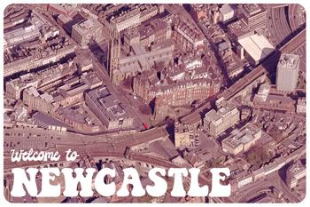
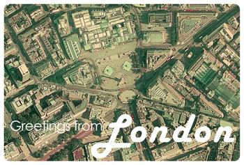
I came across this post over on Creative Bloq (and subsequently followed it through to Akos Papp's Postcards From Above blog) and I was so impressed with the range of postcards that he's created that I thought I'd have a go at my own. I've only done two, of Newcastle upon Tyne and London, but in both cases I've tried to pick specific locations and an image treatment/font combination that 'ages' them.


In Newcastle's case, I've gone for a faded pink/red colour cast so typical of the Seventies, and I've gone for a retro font treatment to go with the colours. The view is from Google Maps and depicts the train line that runs through Newcastle, with the Castle Keep, Vermont Hotel and Moot Hall to its south, with the Black Gate, Milburn House and St Nicholas' Cathedral to the north.


In the case of London, I went for a more faded, vintage colour, and a Fifties style font to match the colour. The view is of Trafalgar Square, with the National Gallery in the top centre of the image. It just goes to show that you can find source material in all sorts of places.

What do you think?

Wednesday, 17 October 2012

Liven Up A Photo

Sometimes you can take an image on a camera phone, and it looks perfectly alright on the screen, but you look at it on your PC and suddenly you notice it's a bit flat. It's easy enough to 'pep up' a slightly faded looking image, and I've done it here in just three steps.

I took this image of the sun rising over the field I pass on my way to work. It's nice, and the one advantage of the shorter days is I'm actually up in time to see sunrise.


Still, things could be improved. A couple of colour balance layers bring out the blue in the sky, and put the green back into the frost-encrusted grass.


I like that lens flare that the camera naturally introduced, but a tad more won't go amiss.


And finally, a vignette to drive the eye inward.


Yes, Instagram can do all these fancy things to your images, but instead of automated filters, isn't it nice to just do it yourself?

Wednesday, 10 October 2012

Changing the Weather

Following on from the digital rain tutorial that I posted last week, I thought I'd share a short process for how I drastically altered a stock image.

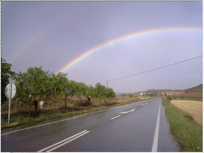
I started off with an image of a road and a rainbow from Sxc.hu.


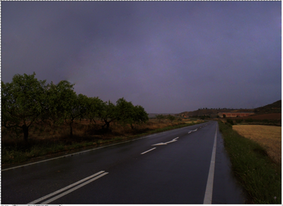
Then I removed the rainbow, cloned out the people on the left hand side, cropped the image to remove the sign to the left, and darkened the whole image using both Levels and the Brightness/Contrast function as adjustment layers.


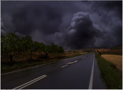
Next I added storm clouds from another stock image, this time on a new layer set to 'Multiply'.


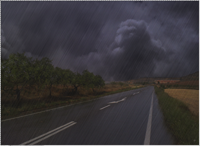
Then I added my first layer of digital rain.


And another, this time set to 'Multiply.


And finally, a dark vignette around the edges!


Wednesday, 3 October 2012

#Tutorial - Digital Rain

Every now and then, it's nice to be able to change the weather. Sometimes taking photos of rain doesn't quite work, so in this tutorial, I'll show you how to add artificial rain to an image. This will either boost any existing rain, or change the weather altogether! I'm going to use this photo I took on the North York Moors.


Now, duplicate the layer (Ctrl / Cmd + J). Go to Filter > Add Noise. Choose Uniform and Monochromatic, and a fairly high number.


Now go to Filter > Blur > Motion Blur. I've chosen an angle of 60o, but you might want to have the rain slanting in a different direction. Experiment with the amount until you get something similar to this.


You'll have an odd border where the blur has faded out, so hit Ctrl/Cmd and T to bring up the Free Transform option. Drag the blurred section so the border is beyond the edge of the image. Hit Enter to accept the change.


Now you'll need to alter the opacity, or change the blend mode, to make it look like rain. I have mine set on Vivid Light at 99%. Voila! Digital rain!


If you've had a go, post your result in the comments so I can have a look!

Wednesday, 19 September 2012

Creating Photoshop Brushes

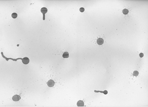
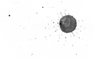
Finding the right brushes for use in a project can be time-consuming, and working around copyright restrictions can slow down your work flow. Creating your own brushes is a quick, fun and easy way to solve the problem! I'll show you how to turn a page of ink splats, made using drawing ink and a pipette, into a set of Photoshop brushes.

1) Produce your page of mixed media and scan your image.


2) Go to Image > Adjustments > Desaturate.


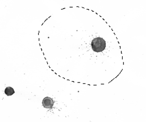
3) Using the Lasso Tool, draw a selection around one of the ink splats. Press Ctrl/Cmd + C to copy the selection.


4) Now create a new document (Ctrl/Cmd + N) and press Ctrl/Cmd + V to paste the selection into the new page.


5) Press Ctrl/Cmd + L to bring up the levels window. Drag the left hand slider in to darken the splat. Now go to Edit > Define Brush Preset and give it a name.


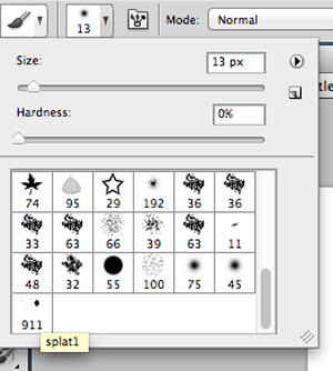
6) If you open the Brush palette, you’ll see your new brush!


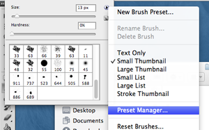
7) Repeat the process for all of your other splats. When you’re finished, click on the small arrow in the top right of the Brush palette. Choose Preset Manager from the dropdown menu.


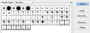
8) Click on the first of the brushes you made. Press Ctrl/Cmd and click on all of them. When you’ve selected them all, click ‘Save Set’ and give it a name.


You can now load these brushes into Photoshop on different machines. If you want to download these readymade ink splat brushes, you can find them here.

Thursday, 30 August 2012

Early Halloween

Yes, I know it's still only August, but I felt compelled to doodle a cartoon pumpkin holding a scythe yesterday. As you do. So I thought I'd quickly run through my process from taking a hand drawn picture through to a digital piece of art.

First of all, I drew the pumpkin in pencil, and outlined it using a 0.4mm black fine liner. I took a photo of it using my camera phone and emailed it to myself.


It's a bit dark and I need to be able to see the lines to trace them, so I used both the Levels and Brightness/Contrast command to tidy up the picture a little. Doesn't that look better?


Now I place this into Illustrator (on a locked layer) and I use the Pen Tool to trace around each of the shapes. I keep each thing on a separate layer, so the scythe is below the hands layer, and the feet are below the body layer, and so on. It gives much cleaner lines than trying to work with my original pen lines!


I use Illustrator to block fill each shape with flat colours. This gives me a solid base to work on when I get onto the next step.


Now I take it into Photoshop and create a new 'shading' layer for each part of the pumpkin. Using a soft round brush at around 40% opacity, I add highlights and shadows by choosing lighter and darker shades of the flat colours. As a finishing touch, I applied a radial gradient to the background, and added a shadow beneath the pumpkin. I also used a canvas texture on a separate layer to add some punch to the piece. I also added a border with rounded corners, and a copyright notice.


Happy Halloween!

Sunday, 12 August 2012

Paintings 01

I decided a couple of weeks ago that I wanted to take up some form of painting again. It's been years since I did any proper painting, not since my art A Level, in fact, aside from some low level digital painting. I knew I wanted to try to master digital painting, but I also wanted to try a more traditional form. I was torn between oils and watercolours - I'd done oils at school but knew they were both messy and expensive, while watercolours were far more readily available. So far, I've just really been practicing with washes, colour mixing, and different techniques, but I did want to try and paint something recognisable, instead of just page after page of meaningless colour. This was one of my first attempts.


It was really rather simple. I began with a graded blue wash, simply adding more water to dilute the colour, to make the sky lighter as it approached the horizon, and then dried my brush in order to apply the blue paint for the water using the dry brush technique. The resulting white patches among the lines resemble light on water.

Once the sky and water were dry, I then used a much finer brush to sketch in the boat using dark brown. When it was dry, I added another layer to give a shadow and sense of depth to the hull and mast. Again I used the dry brush technique to add a reflection in the water.

All in all, I'm pretty pleased with it - it's not exactly going to blow the minds of the art world but it's simple and recognisable!

As for my attempts at digital painting, I loaded up Photoshop CS5, plugged in a Wacom Bamboo, and had a go.


I started off by actually tracing the tree outline from a photograph, and just added shadow by going over the areas several times. Then I created several background layers, altered different brush settings in the Wet Media brush set, and created a graded sky by sampling colours from a photograph of a sunset. I was quite pleased with the stipling on the grass, and the blending of the sky, although the white cloud effect doesn't work. All in all, I think I may give digital painting another go!